.png)
We are happy to share that the Thryve Dashboard has been redesigned from the ground up. The new version is now live, bringing a more modern and cleaner UI/UX to the tools that development and business teams use every day to build, configure, and monitor their wearable data integrations.
At Thryve, we make sure that our customers get the most reliable and user-friendly infrastructure. The redesign is focused on making the most frequently used parts of the dashboard more accessible, easier to read at a glance, and faster to navigate, which matters when you are managing live health data integrations that need to be reliable. We will go over the most exciting changes and how they make your dashboard life easier!
The left-hand navigation now groups functionality into three clear areas: Configurations, Users, and the top-level Overview. Configurations covers the settings that define how your integration behaves — Data Sources, Data Types, and Webhooks. The Users section provides access to Review Users and Analyse User Data. The structure reduces the number of clicks needed to get from the overview to any specific configuration, and the visual hierarchy makes it easier to orient yourself across a complex setup.
The top-right toggle between Staging and Live environments is now clearly surfaced on every page, making it harder to accidentally apply changes to the wrong environment — a practical improvement for teams managing both testing and production configurations simultaneously.
Adding to the visual update, the dashboard now includes a dedicated Profile page where customers can find their app settings, subscription details, and team management information in one place. Previously, this information was distributed across multiple areas. Consolidating it into a single page reduces the time spent navigating between sections for routine administrative tasks.
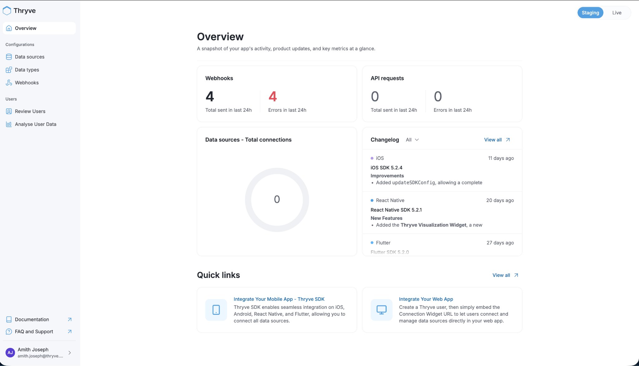
The Overview page is the first screen partners see when they log in, and the redesign gives it more weight. It surfaces four key metrics immediately: total webhooks sent in the last 24 hours, webhook errors in the last 24 hours, total API requests, and API errors. These numbers do not require any navigation to reach — they are visible the moment you open the dashboard.
Below the metrics, a Data Sources panel shows the total number of connected end users across all active sources. A Changelog panel on the right displays the most recent SDK updates across iOS, React Native, Flutter, and other supported platforms, with release notes linked directly from the overview. This means partners can track SDK changes, including new features like the recently added Thryve Visualization Widget in the React Native SDK, without having to consult external documentation. Quick links to integration guides for mobile and web are also accessible from this page.
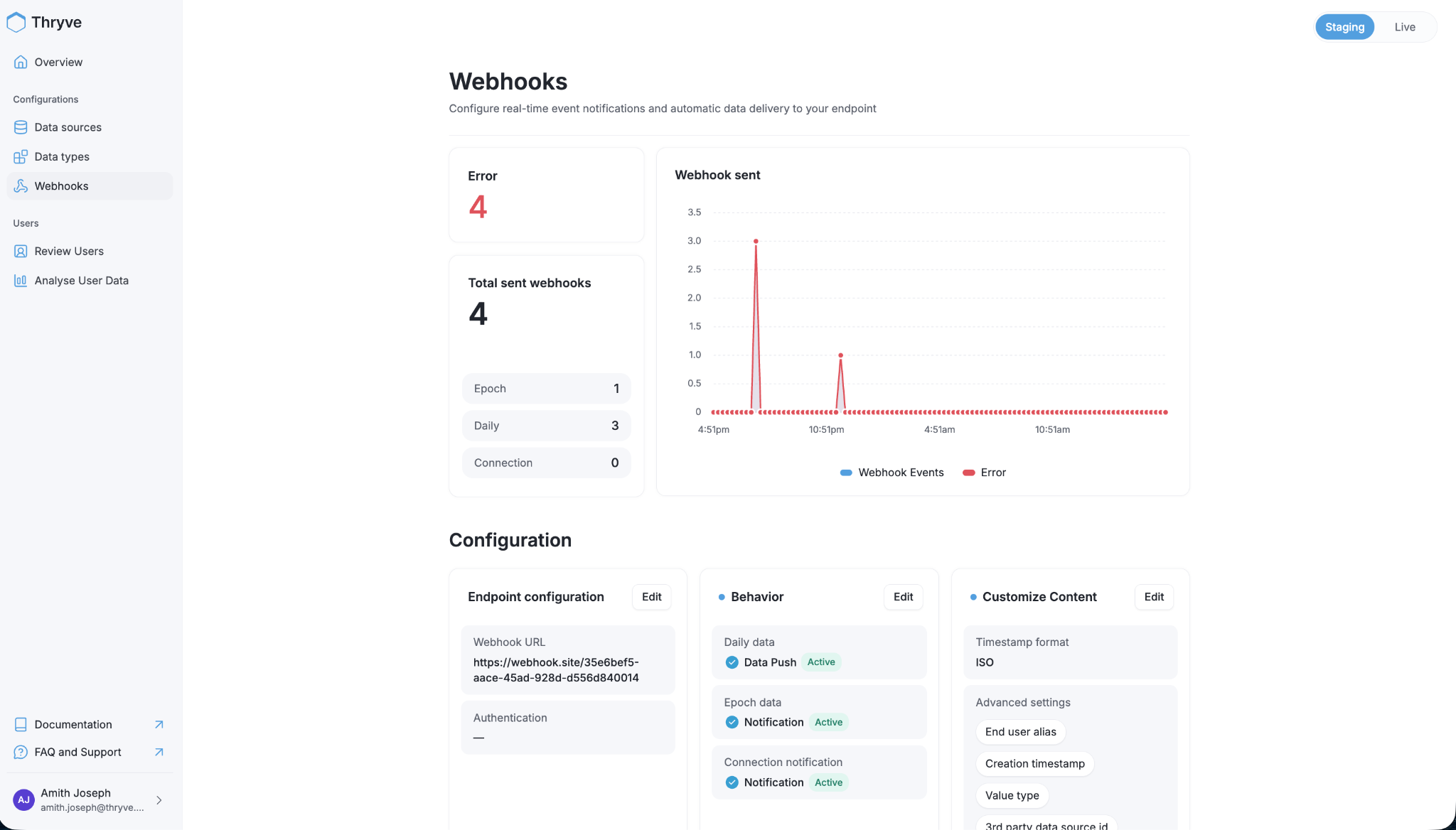
The Webhooks page has been redesigned to give a clearer picture of delivery health. A summary panel shows total webhooks sent alongside an error count, with a breakdown by delivery type: Epoch, Daily, and Connection events. A time-series chart plots webhook events and errors side by side over a 24-hour window, making it straightforward to identify when delivery failures occurred and whether they were isolated or sustained.
The Configuration section below the metrics remains the place to manage endpoint settings, delivery behavior, and content customization, including timestamp format, end-user alias, and advanced fields like value type and third-party data source ID. The redesign makes the relationship between these settings and the delivery metrics more visually connected, so it is easier to correlate a configuration change with a change in delivery behavior.
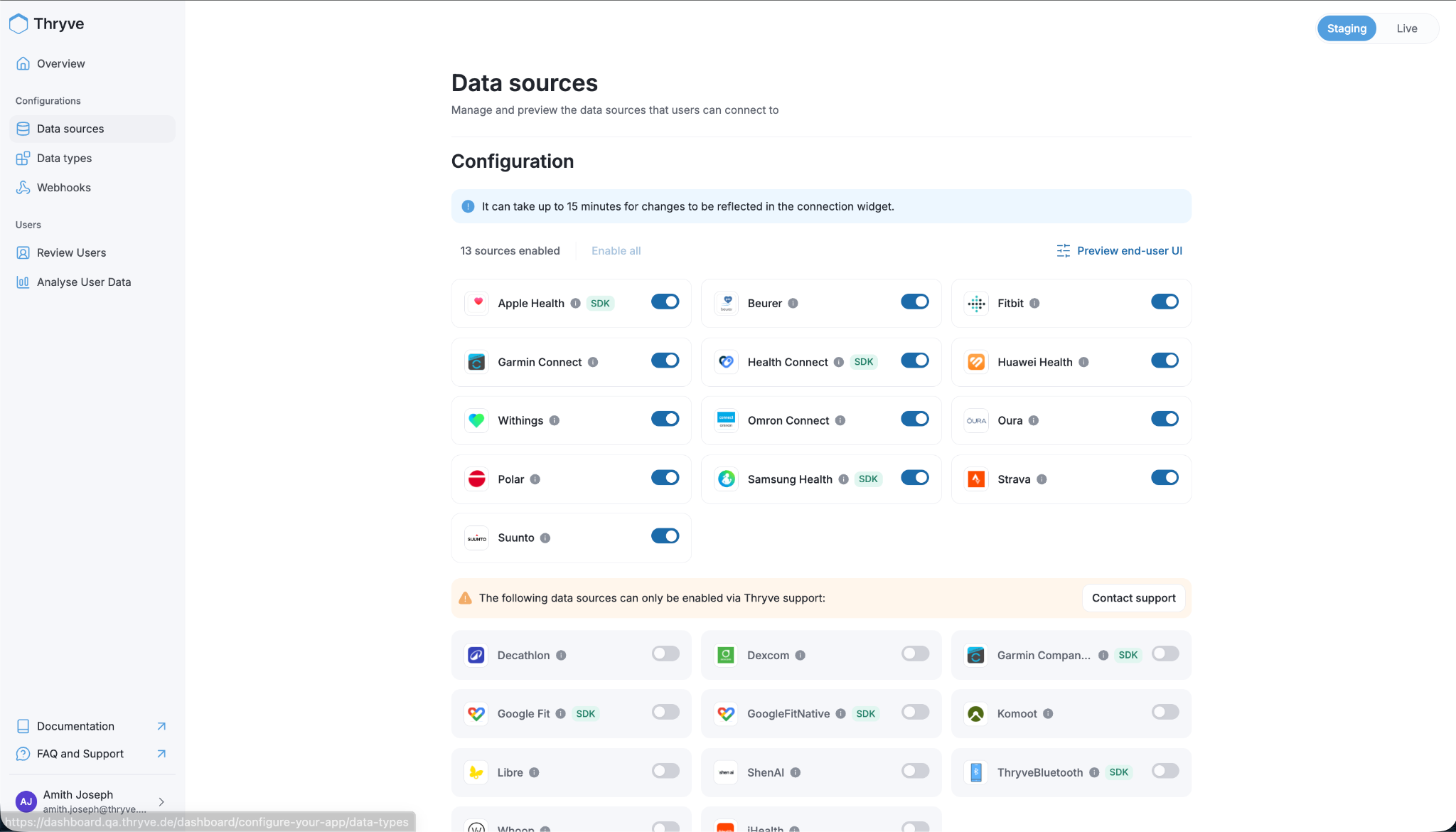
The Data Sources page shows all the wearable platforms and health apps that can be enabled for end users to connect. Sources are organized into two tiers:
Sources marked with an SDK tag, such as Apple Health, Health Connect, and Samsung Health, require the Thryve SDK to be integrated into the partner's mobile app rather than connecting via API alone.
A Preview End-User UI option is available directly from the Data Sources page, allowing partners to see exactly what the connection experience looks like from the end user's perspective before deploying it to production.
At Thryve, we focus on building infrastructure that supports our customers' growth. As your integration matures, your team expands, and your compliance requirements evolve, the tools you use to manage that integration should keep up. The new dashboard is designed to reduce the operational overhead of running a production health data platform without compromising on data compliance. A cleaner interface does not mean a less rigorous one.
If your organization is building on wearable data and needs infrastructure that is both easy to operate and compliance-ready from day one, book a demo with Thryve!
For our current clients, the new dashboard is live now at dashboard.thryve.de. More information can be found in our API documentation.


