.png)
In today’s digital health ecosystem, data moves faster than ever, while visibility, clarity, and usability often lag behind. Digital health organizations now face handling massive volumes of wearable, lab, and behavioral data every day. Yet for many teams, understanding how that data flows, where it’s coming from, how it’s performing, and whether it’s being processed correctly, can still be a challenge.
Thryve’s new Dashboard update changes that. Built from the ground up to simplify data operations, the redesigned interface gives users a complete, real-time overview of their integrations, data connections, and performance metrics. From onboarding a new partner to tracking API reliability, every feature is now centralized in one intuitive, customizable space.
As Thryve’s partnerships grew, so did the complexity of managing and understanding health data. Our partners now operate across multiple use cases, from wearable-based prevention programs and clinical research to large-scale digital health platforms. Each of these scenarios generates massive streams of diverse data that need to be monitored, validated, and acted on in real time.
We listened closely to our customers, who told us they wanted more than just access to data; they wanted clarity. Developers needed faster ways to debug integrations. Compliance officers wanted transparent oversight of system performance. Health organizations needed a simple, visual way to track user engagement and data reliability.
The new Thryve Dashboard is our answer to that feedback. It was rebuilt to give every user, whether technical or operational, the ability to see the full picture of their data ecosystem at a glance. Instead of jumping between logs, endpoints, and manual reports, everything is now centralized and visualized in one secure, intuitive interface.
This redesign isn’t just about better visuals; it’s more about empowering customers to manage data more intelligently and proactively, transforming how digital health operations are monitored and optimized.
The redesign introduces structural, functional, and usability improvements that make monitoring, analyzing, and managing data both simpler and more powerful.
1. Unified Overview Page
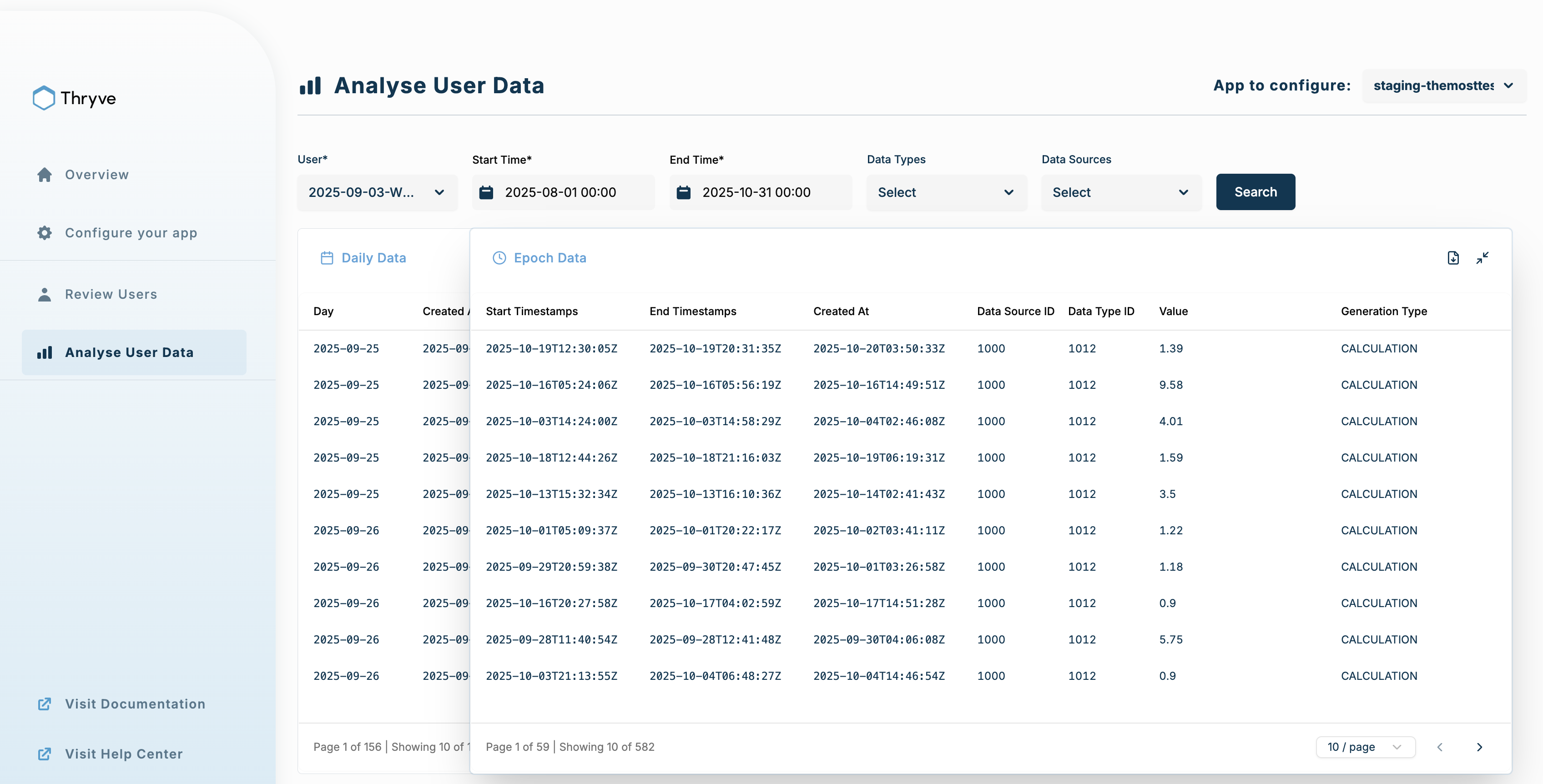
At the heart of the new dashboard is the Overview Page, which consolidates everything that matters most into one clear view. You can now see the status of your connected users, data sources, and synchronization health all in real time. Whether you’re checking integration performance or verifying that all data streams are active, it’s now accessible without switching between tabs or tools.
2. Improved Data Transparency
We’ve added real-time visual summaries that help you understand connection health, sync frequencies, and potential issues at a glance. Clear graphs and indicators make it easy to identify data dropouts, latency, or errors before they impact your operations. This transparency gives both technical teams and project managers actionable insight into how data is flowing across your platform.
3. Smarter User Management
Managing hundreds or thousands of connected users has never been easier. You can now search, filter, and segment users based on connection status, device type, or data activity. Role-based permissions also make it easier for large teams to collaborate securely, ensuring the right people have access to the right insights.
4. Advanced Performance Metrics
Developers and analysts can now track API usage, response times, and data reliability directly from the dashboard. These metrics help optimize integrations and monitor performance trends over time, giving your team greater control over data delivery and system efficiency.
5. Modern, Responsive Design
Finally, the interface has been reimagined to feel cleaner, faster, and more intuitive, optimized for both desktop and mobile use. Every component was redesigned to help you focus on what matters most: insight, not complexity.
Developers now have complete visibility into their API activity and webhook performance without diving into logs or console data. Every request, response, and error is displayed in a structured, visual format.
This transparency cuts troubleshooting time, reduces dependency on manual monitoring, and makes API maintenance almost effortless.
For hospitals, insurers, and digital health platforms, the updated dashboard goes beyond data visualization; it provides operational intelligence. Teams can monitor user engagement, connection stability, and population-level trends with ease.
Together, these updates make Thryve’s dashboard not just a management tool but a real-time command center for connected health ecosystems.
The redesigned Thryve Dashboard is a major leap toward smarter, faster, and more transparent health data management. It simplifies integration, strengthens visibility, and empowers users with insights that drive real-world impact.
Explore the new interface, test its features, and share your feedback, as we’re building this future together.
Check our API documentation for a more detailed overview!
Book a demo today to experience the next generation of health data intelligence!


